Mad Fruit
Packaging & Label
An explosion of colors and flavors, with a bold, fruity twist.


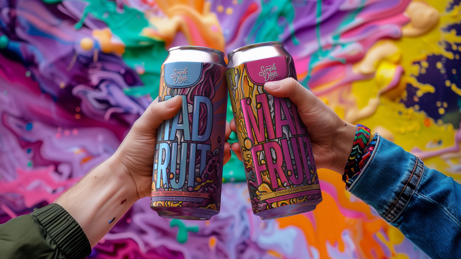
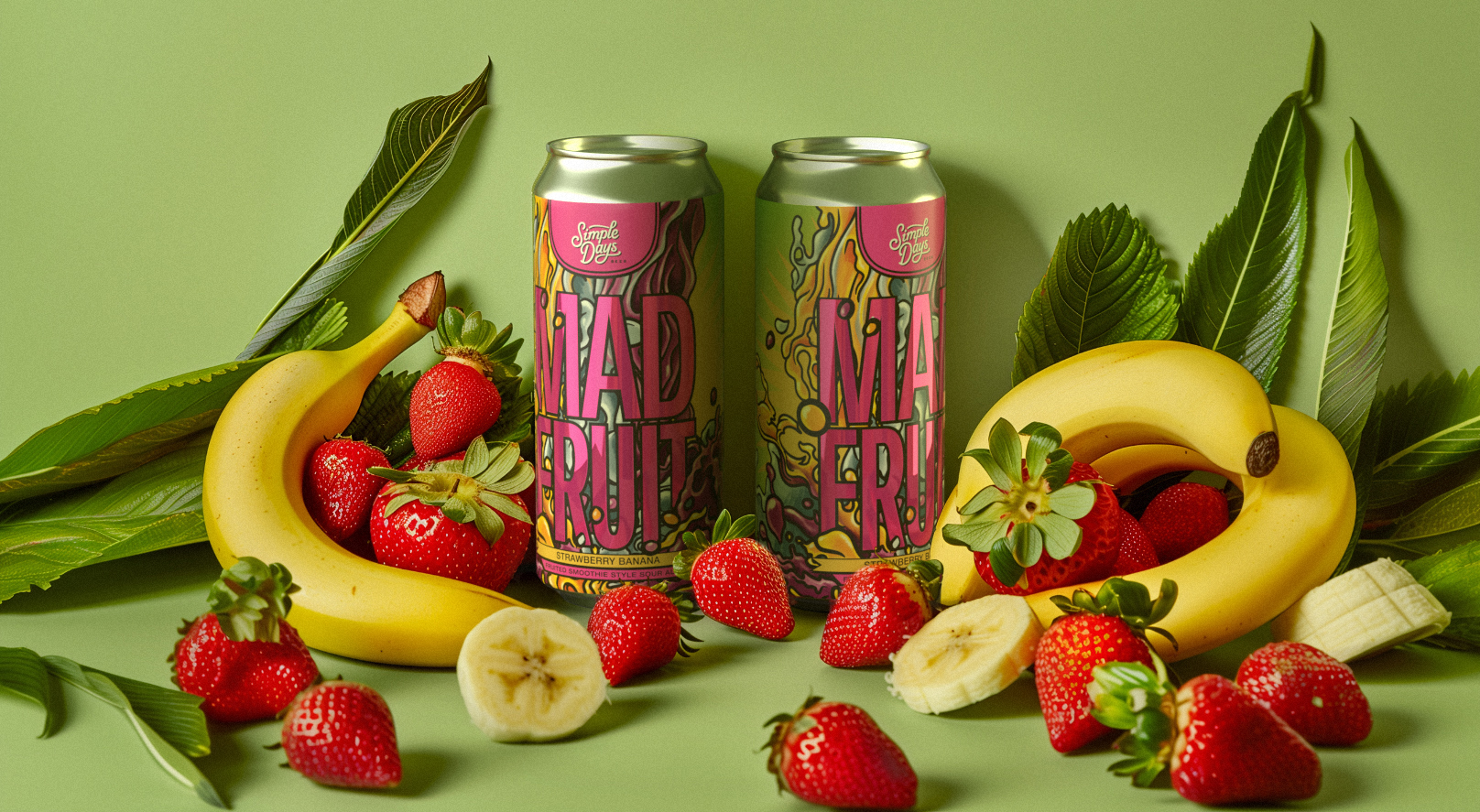
For the “MAD FRUIT” beer label design, we created a concept that combines visual impact and flexibility.
Typography takes center stage, as a totem pole imposes itself on the layout to meet the goal of ensuring that the product name was the first element the consumer noticed.
The color palette is an explosion of vibrant fruit-inspired colors: bright tones of purple, orange, and green evoke the very essence of this craft beer, which celebrates the freshness of fruity ingredients. The use of textures and glossy details adds an extra layer of interest, enriching the sensory experience of the person holding the can, tying the label to the same sensation of discovery and pleasure as sipping the beer.
The purpose of the design is to be appealing, especially to a predominantly female audience, and the beer must immediately stand out among competing products. It was important to maintain a strong and recognizable brand identity, but at the same time versatile: future variants of fruity beers will be able to maintain the same visual style by changing only the colors and names of the fruits, while keeping the brand recognition intact.
The label design of “MAD FRUIT” manages to combine boldness and vibrancy with a playful touch. Its flexibility ensures that each new beer in the line can be launched with a clear and instantly recognizable identity, adapting to different tastes without ever losing the essence of the brand.
YEAR / 2024
PLACE / United States of America
PLACE / United States of America
